WILDLY FLAVOURSOME,
TEMPTINGLY CRUNCHY
A Riot Of Pattern And Produce
Creative / Art Direction, Strategy, Branding, Packaging Design
By innovating on the traditional potato crisp category and introducing unconventional fruit and vegetable flavors, Emily disrupted the market. Drawing inspiration from Emily’s unconventional approach, I created a brand that intentionally stood out from the crowd by breaking away from the minimalistic design norms prevalent in the category. Instead, I leveraged bold and captivating patterns to create a brand that celebrated the unique product offerings. Through a collaborative effort with a talented illustrator, we created packaging art that was unparalleled in its creativity and uniqueness, much like the product itself.
Discover Bolder, Tastier, Crunchier
Creative / Art Direction, Design & Strategy
The launch of Emily needed to make a statement so I crafted a dynamic campaign that fully embodied the vibrant essence of the brand. With a tight budget and an even tighter timeline, I took on the challenge of creating a high-impact campaign that would make the most of the beautiful painterly Emily patterns and incorporate a sense of discovery to engage consumers.
Drawing on best practices in FMCG ATL marketing, each creative showcased a different flavour and pack, while maintaining consistent positioning and messaging to build brand recognition. Through a thoughtful and intentional approach to the campaign, we were able to successfully launch Emily and establish it as a standout brand in the market.
Welcome To Emily’s House
Creative / Art Direction
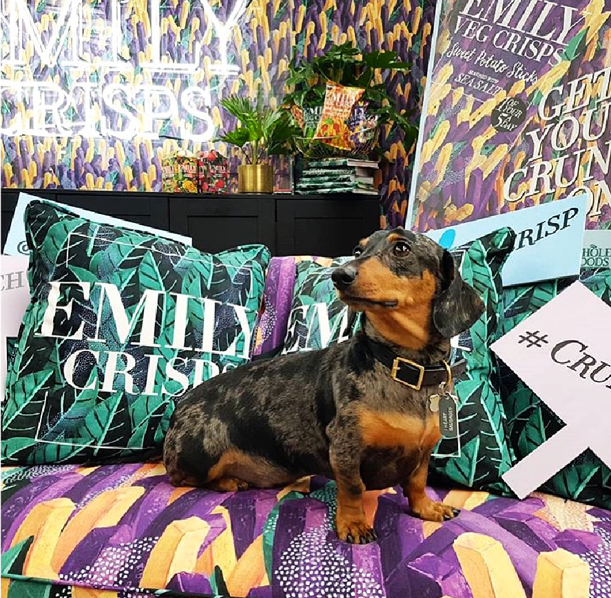
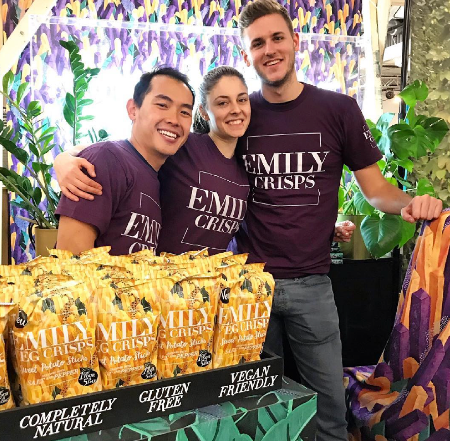
Within a busy event space we wanted to create an intimate moment for our customers in order to connect with them. We thought it was important to make a big impact by how we used the space rather than just hang around behind a bar like everyone else. With that in mind, we created a living room set that was unlike any of the stands around us. As we knew that our stand would be on the smaller side we needed to make the most of our maximalist brand assets and encourage people to try our snacks.
Click To Discover
Creative / Art Direction & Strategy
A sense of discovery was the key element in the website brief so we created an interactive solution that changed with every refresh. Inspired by Instagram, we wanted a feed at the homepage that felt unique each time by shuffling through 100s of images and making some larger at random to increase the interest. These images were pulled through from our social channel at the back end creating an easy impactful solution.
Celebrating Social
Creative / Art Direction & Strategy
We had a blast using social to bring the world of Emily to life. Playing with our packs, patterns and people to bring a stylised feed together that was a visual treat.
Maximalist Multipacks
Creative / Art Direction & Packaging Design
As a premium proposition, I created a multipack of crisps, unlike others on the supermarket shelves. Packed in a beautiful box nestled four packs in bespoke miniature bags - perfect for a lighter, fruitier snack.


